Häagen-Dazs


YEAR

[taxonomy date]


DELIVERABLES

Art direction

Print design

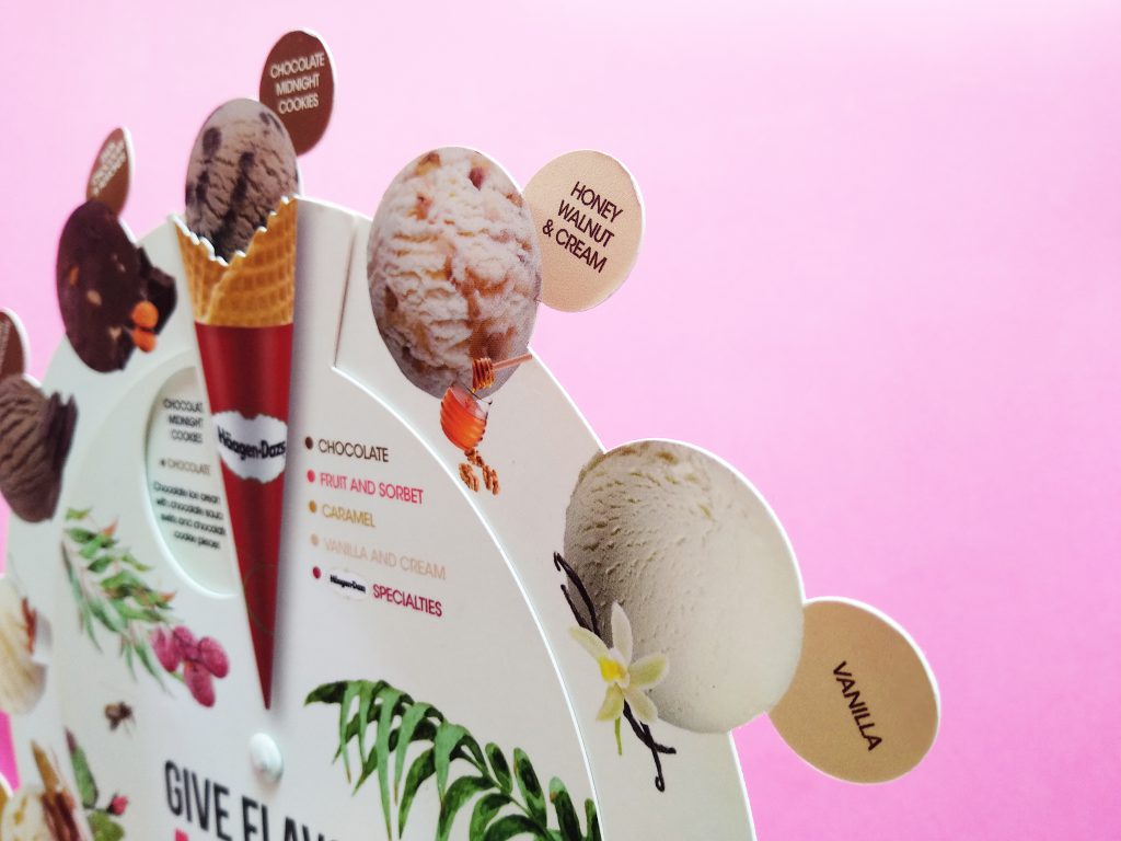
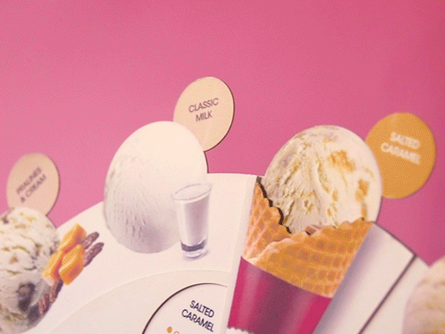
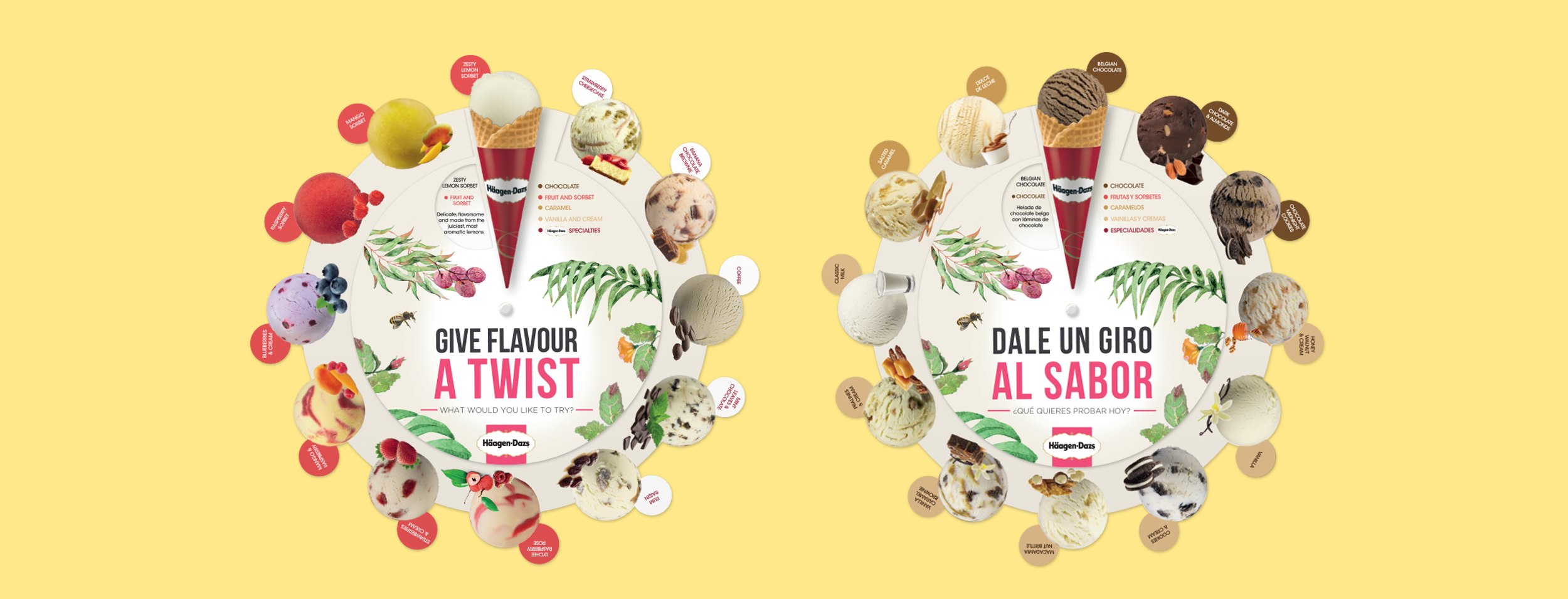
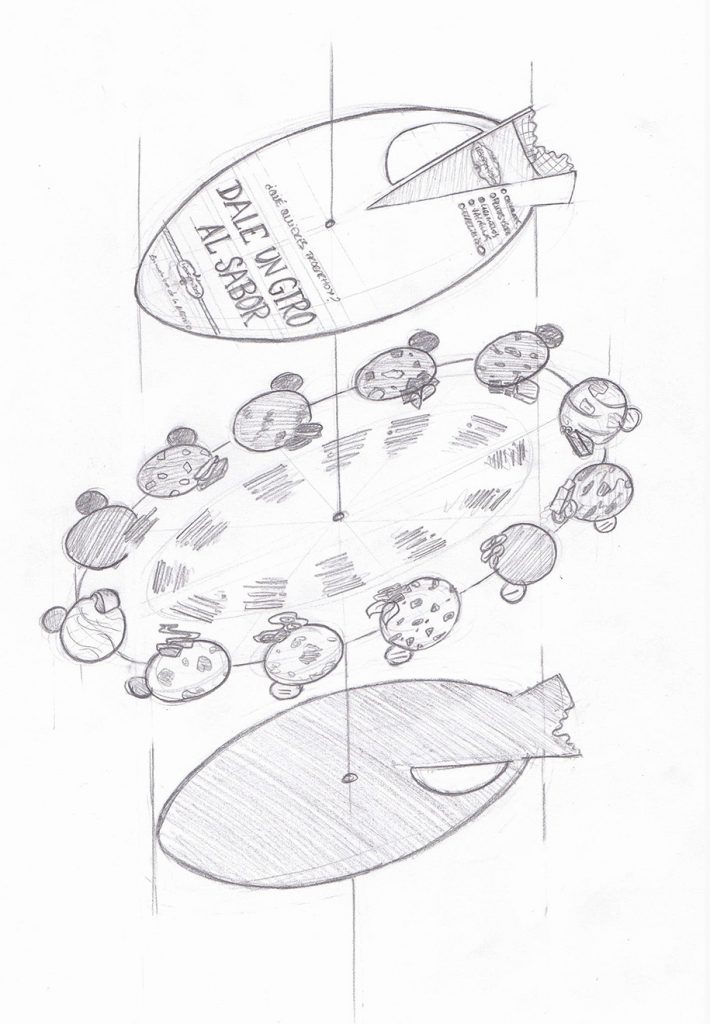
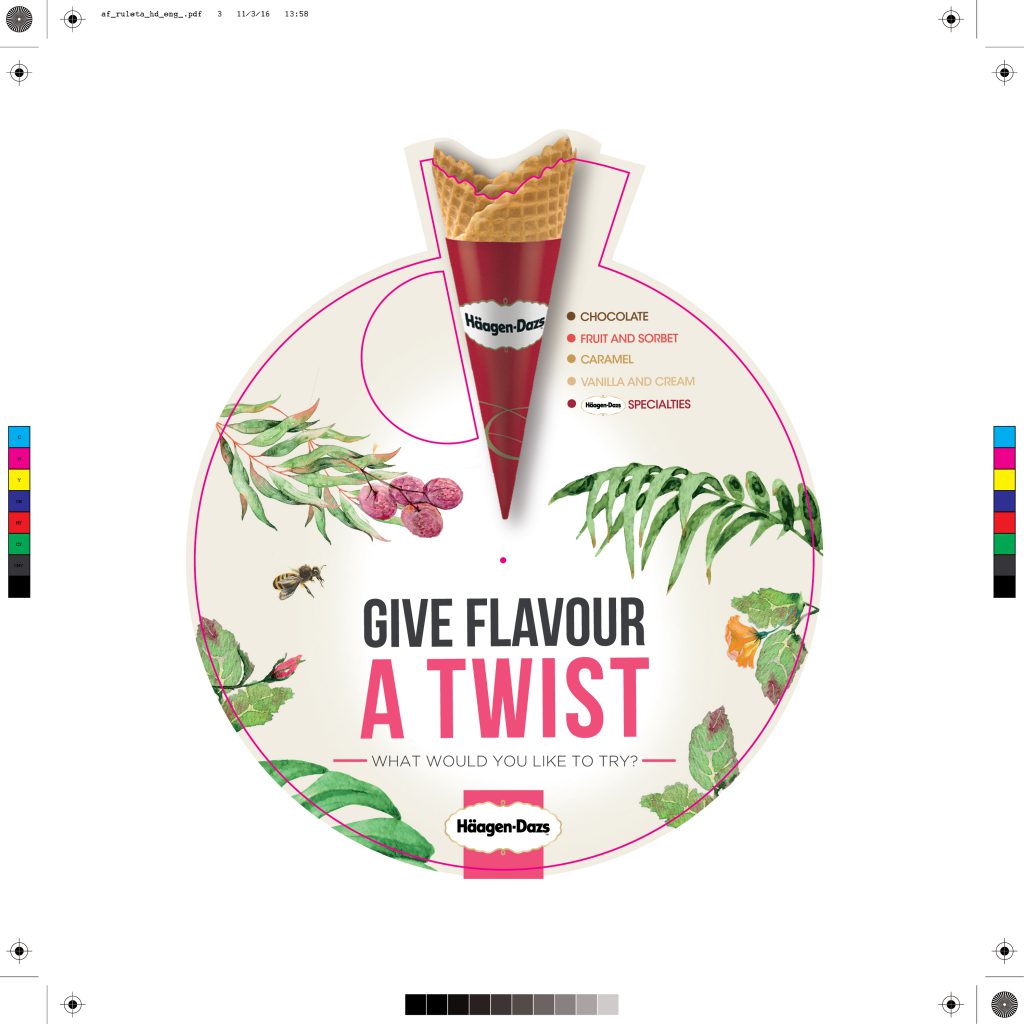
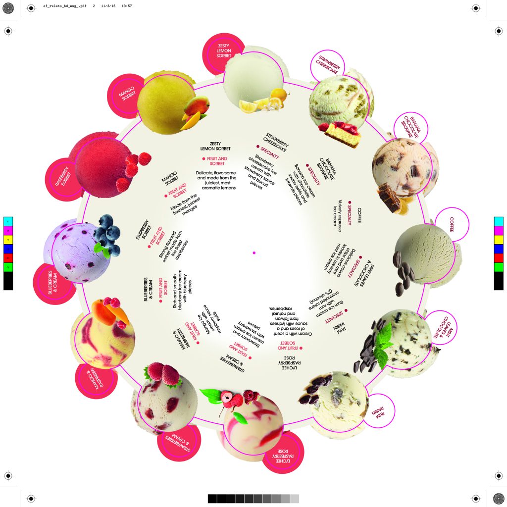
Give flavour a twist (literally)

Häagen-Dazs wanted to reinvent the user experience on their restaurants and stores. We created a menu that showed at once all the ice cream flavours, grouped in five categories: Chocolate, Fruit and sorbet, Caramel, Vanilla and cream, and Häagen-Dazs Specialties. When the cone is spinned and placed upon the ice cream ball, the ingredients of the chosen flavor are shown. This is a second version, redesigned with a bigger size for better usability and adapted to the Spring-Summer campaign.

The image shows two versions (English and Spanish) of the pop-up menu produced for Häagen-Dazs. It consists of a central piece where the ice cream balls are shown and two pieces, on each side, with a cone.
Concept
Sketch of the three pieces of the menu before assembly.
Print design
Print file of the outer piece.
Print file of the central piece.
Finished product
Detail picture of the menu.

Debate Camp


YEAR

[taxonomy date]


DELIVERABLES

Art direction

Illustration

A talk about #metoo

Art direction and stationery design for the 10th Debate Camp of young researchers on Gender issues, organized by the University Institute for Women’s Studies (IUEM) of the Autonomous University of Madrid (UAM).

The image shows three equal posters of the X Debate Camp taped to a concrete wall. The poster shows the silhouette of the head of a person, presumably a woman, whose interior shows the texture of a demonstration. From the head comes a form that collects the title of the event and the data.
Brochure and folder
Interior of the two-fold brochure.
Back piece of the two-fold brochure.

Loveless Tarot


YEAR

[taxonomy date]


DELIVERABLES

Art direction

Illustration

Bad cards, loveless future

Loveless Tarot (Tarot del Desamor) is a study about tarot and its relationship with chance and destiny. It takes Spanish all time idioms and gives them new meaning by pairing each with a tarot card. In a time in which we are consumed by work, compulsory leisure and individualism, the idea that Tinder is the primary tool for finding love often presents us with a bleak picture. Cards don’t matter if the deck is bad. Tarot del Desamor is an ongoing project.

Four tarot cards (major arcana fifteen, reversed three of swords, reversed major arcana eighteen, ace of swords) over a red velvet background
Meaning and reading
Ace of swords tarot card. On the top there's a roman number one (capital letter i). The center contains the illustration: a sun with a crying eye, throws its rays downwards, facing a sword and two crescent moons. On the lower part of the letter, the words "Medias tintas", which in Spanish mean "half measures".
Medias tintas can be translated as “half measures”.

Medias tintas

Oh, the ambiguity! Do they love me, do they not? Are we f*ckbuddies, friends with benefits, are we ANYTHING at all? Who knows?! They know, probably.

Ace of swords represents reason, that moment of clarity in which we make the determination to pursue what we want. It urges us to take the step, to ask for answers. No half measures.

Three of swords tarot card. On the top there's a roman number three (three capital letters i). The center contains the illustration: a crying heart is crossed by three swords, from the bottom corners, two black clouds rain in the direction of the heart. On the lower part of the letter, the words "Mala sangre", which in Spanish mean "bad blood".

 Abajo el nombre de la carta es "Mala sangre".
Mala sangre can be translated as “bad blood”.

Mala sangre

In a reading about love, three of swords is not a good card, no matter if reversed or not, there’s no way around it.

Maybe those profile pics hide some rotten teeth, or what seemed like smart sarcasm on the chat is plain bad education IRL. We can’t always skip the bad experiences, and yes they help us learn and grow, but this time the tarot is telling you to swipe left.

Tarot card corresponding to the major arcana of The Devil. At the top there's a fifteen in Roman numerals (capital letters XV). The central part contains the illustration. Stairs lead to a door from which flames of fire come out. In the upper left corner there is a closed eye. In the lower right corner, a pointy tongue representing the devil. On the lower part, the name of the card is "Malagón".

 Abajo el nombre de la carta es "Mala sangre".
“Going from Málaga to Malagón” is a Spanish idiom. It means trying to solve a negative situation and ending up worse than before.

Malagón

The Devil card of Major Arcana sounds scary but… What’s life without a bit of emotion?

This card talks about a very intense sexual energy, period. If this is what you and your boo are looking for, congratulations! Otherwise, you better unmatch when the time comes, be honest!

Tarot card corresponding to the major arcana of the Moon. At the top is eighteen in Roman numerals (capital letters XVIII). The central part contains the illustration. A hand with the palm facing up is pierced by a burning nail. The index and middle fingers are crossed. At the top is a moon. Below the name of the letter is "El clavo ardiendo" or "The burning nail".
“Agarrarse a un clavo ardiendo”, or “holding on to a burning nail” is a Spanish idiom. It means pinning one’s faith on something as a last hope, usually with a bad result.

El clavo ardiendo

This is Major Arcana card of The Moon. The moon shows its shine but has also a changing nature. This is an indication that maybe you’re not seeing things as they are, but as you want them to be. Stop justifying your crush’s behaviour, don’t believe your own lies.

The image shows various print tests on different types of paper and with different inks (black, red) and different pressures, scattered.

The image shows a collage of three amulets (some palo santo, a piece of red cloth and a lapis lazuli stone) on a red velvet background.

Kidcast


YEAR

[taxonomy date]


DELIVERABLES

Branding

Design for social media

Art direction

A grown-up podcast

Brand identity and social media design of Kidcast: the podcast about kids marketing created by the agency The Modern Kids & Family, hosted by Nacho Toribio and Irene Mañero. Its image was created looking for a look inspired by Gen Z aesthetics. Strategically, different post categories were created in order to create hype around each episode before it was released, and to generate conversation afterwards, encouraging social media interaction and engagement among the listeners, which resulted in growth of the followers and therefore, potential clients.

The image shows a full-width coral rectangle over which, on the left side, the logo of KIDCAST by TMKF is shown. On the right side, four rows of Instagram Stories designed for different episodes of the podcast.
Logo
Color palette
Graphic elements and style
The image shows four geometric patterns, some organic shapes with a gradient color from orange to fucsia, and the picture of a young woman with a pink, sharp drop shadow. All of these elements take part in KIDCAST's visual image.
Typography
Mr. Eaves Heavy
Mrs. Eaves bold italic.
Instagram Stories template design
Three Instagram Stories templates over a yellow horizontal band.
Main template, used for the title and image of the episode, and template for "Kidcast recommends".
Templates for quotes and highlights.
Other platforms
Design for Instagram Stories, Facebook and Instagram post, and Twitter post.

Chichinabo


YEAR

[taxonomy date]


DELIVERABLES

Art direction

Print design

To speak as a native, like, for real

Self-published compilation of Spanish popular expressions and idioms, because having a C2 level is fine, but no other dictionary will give you the satisfaction of correctly using “Bernarda’s p***y” in a conversation.

The image shows two equal zines over a pink background. The zine on the left is closed and we see the cover of CHICHINABO: small dictionary of Spanish popular expressions and idioms to speak as a native", and a stamp with the face of Arturo Pérez-Reverte and the text "Pérez-Reverte's Seal of Approval". On the right, the same zine but open.

Pérez-Reverte’s Seal of Approval

Chichinabo is the only zine that has this exclusive (100% REAL, 0% MADE UP) recognition.

Several zines over a grey background.
A drawing of Pérez-Reverte's face saying "See you later, maricarmen"

Strong Squad


YEAR

[taxonomy date]


DELIVERABLES

Branding

Art direction

F*** your beauty standards

Strong Squad was born as a safe space for crossfit training aimed at LGBTQIA+ teens and women in Navan (Ireland). Far from aesthetic goals, the trainer Beatriz Ruiz de Aguiar wanted the users to be stronger inside and outside the box. The project includes naming, identity and design of corporate elements that serve as the basis for brand communications.

The image shows three stickers on a high school locker. One of the stickers reads "#F YOUR BEAUTY STANDARDS" over a pastel colors gradient. The second sticker is rounded and has the Strong Squad logo printed over a pastel yellow background with a pink bolt in the center. The third sticker is heart-shaped and has the same pastel gradient as the first one.

Radical support

Taking into account the target of Strong Squad, both the logo and the color palette are chosen with the purpose of creating a soft image, amicable towards future members and away from the imaginary created around crossfit. However, certain elements (the pure black color, the lighting bolt, even the name) turn Strong Squad into a meeting point of physical effort and mental and emotional empowerment.

Logo
Color palette
Typography

You got it, gurl!

Setting the tone in which Strong Squad addresses its audience is crucial. It is not just a space, it is a community, a family, a body, fat & gender positive movement. We take ourselves seriously, have fun in the process and pay no attention to whoever wants to make us believe that we are worth less for not complying with the standards of beauty and behavior.